Understanding Radio Button Specifications in the Onsen UI
Asked 1 years ago, Updated 1 years ago, 53 viewsUnderstanding Radio Button Specifications in the Onsen UI
I am creating an app on Monaca using the Onsen UI.
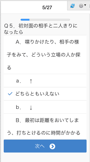
I am using the radio button on the Onsen UI, but if the text of the item is long, it will cause a foldback to the check field.
As it doesn't look beautiful, I'd like to add an intonation (?) so that it doesn't appear in the check box, is that possible?
If you can't do it because it's a specification, I'll consider another way.
<lic class="list__item list__item --tappable">
<label class="radio-button radio-button --list-item">
<input type="radio" name="Kousei_Q" value="2">
<div class="radio-button__checkmark radio-button --list-item__checkmark">/div>
A. Talking to each other and looking at the other person's situation to find out what kind of position they are in.
</label>
</li>
2022-09-29 20:27
1 Answers
It's not very cool, but you can adjust it by specifying the width.
<lic class="list__item list__item --tappable" style="width:200px;">
    <label class="radio-button radio-button --list-item">
        <input type="radio" name="Kousei_Q" value="2">
        <div class="radio-button__checkmark radio-button --list-item__checkmark">/div>
        <span style="float:right;width:150px;">
            A. Talking to each other and looking at the other person's situation to find out what kind of position they are in.
        </span>
    </label>
</li>
2022-09-29 20:27
If you have any answers or tips
Popular Tags
python x 4647
android x 1593
java x 1494
javascript x 1427
c x 927
c++ x 878
ruby-on-rails x 696
php x 692
python3 x 685
html x 656
© 2024 OneMinuteCode. All rights reserved.