[Lectures 3-7] What is the difference between reactive and adaptive webs?
Asked 2 years ago, Updated 2 years ago, 172 views[Lecture 3-7] I'm listening to the lecture on pixel density by device, feeling refreshed. "Let's not follow the past and design for today!" was so touching. Thank you so much
I'm asking you a question because I had a question in the past while listening to the responsive web lecture.
When I heard that responsive web and adaptive web are different, I heard the term adaptive web and looked it up, and I got the following answer.
=> 'Adaptive Web' checks a device that has accessed the web from a server or client and invokes an optimized markup for that device. The optimized markup here exposes only the necessary information, uses an image optimized for the device, and uses JavaScript without flash to analyze the device and apply the appropriate behavior. This allows you to use the website on your mobile at a faster.
I know that responsive webs are classified by mediaquery, but does adaptive web mean creating separate PCs and mobile devices? Then, in general, does the method of creating the web and mobile web separately become adaptive webs? I wonder if you make it with one HTml or separate HTml for PC and mobile.
And I was told that I can't use "mobile first" if I work on a reactive web, so I wonder if this is right. I think mediaquery doesn't work under ie8, so I think I style the PC screen first to respond to ie8 and then go out in the order of tablet and mobile. How can I apply "mobile first" while responding to sub-browser when working on responsive webs?
fast-frontend responsive
1 Answers
Hello, Yuna :-)
I'm glad you said you felt refreshed about the device pixel density lecture! Thank you for your feedback on the lecture.
Oh! And before answering the question, I would like to ask the previous question " [Lecture 4-11] querySelector() about performance issues.I replied to " so please check it. :)
Now! Let me answer your question.
Answering each question is as follows.
I know that responsive webs are classified by mediaquery, but does adaptive web mean creating separate PCs and mobile devices? Then, in general, does the method of creating the web and mobile web separately become adaptive webs? I wonder if you make it with one HTml or separate HTml for PC and mobile.
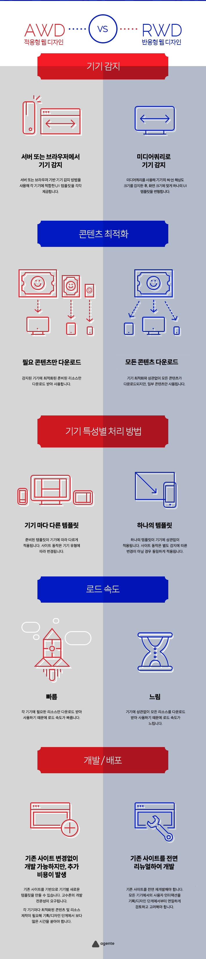
The responsive web responds to all devices using a single template, whereas the adaptive web requires a separate independent template based on the selected device type. This means you need to create a separate page.
For example, portal sites such as NAVER and DAUM are reflected in the adaptive web. Service is performed through a separate URL to cope with the mobile environment without changing existing sites. If you connect to an existing site address in your mobile environment, detect it and redirect it to a mobile-only page.
Let's take a look at infographic that can solve your questions. The advantages and disadvantages of adaptive (AWD) and reactive (RWD) among methodologies for responding to a diversified environment (mobile, desktop, etc.)
And I was told that I can't use "mobile first" if I work on a reactive web, so I wonder if this is right. I think mediaquery doesn't work under ie8, so I think I style the PC screen first to respond to ie8 and then go out in the order of tablet and mobile. How can I apply "mobile first" while responding to sub-browser when working on responsive webs?
The problem with responsive web design being able to do mobile first is not a technical problem, but a problem with planning and experience. In other words, the design strategy determines whether it is possible or not.
Mobile first refers to planning and designing mobile first, but if you say "strong" it is because planning and design are desktop first.
If you look at the image below, it's impossible to push content from a desktop-first designed page onto your mobile. So you have negative experiences, and the responsive web is not mobile-first.
This doesn't happen if it's designed by experts who are well versed in mobile environments and responsive web technologies. The meaning of mobile first is that you can't escape the existing experience of filling up the large screen with content, and then when you ask for a responsive web, you get into trouble.
The real problem is a habit that cannot be abandoned. I need to know how to empty the filled content in a small space, but I don't want to empty it, so there's no way that there's no problem... It doesn't make sense to expect mobile first while planning to do desktop first.
If technology experts were involved in the process of planning services, they would have explained the factors that caused the problem in advance and tried not to go wrong. Of course... on the premise that you listen and accept the opinions of the experts. One of the factors is that it is not easy to meet such clients in Korea.
If you truly understand and design the meaning of Mobile First at the planning and design stage, there will be no problem. Mobile First must follow the "Aesthetics of Filling". After thinking about filling a small screen first, you should strategically design what needs to be filled as the screen size grows.
And it's the desktop first, not just the mobile view, that's responsible for planning, but also for the design and development process. Mobile First Design is the result of forgetting that mobile comes first , so mobile first naturally moves away.
reactive web design with the methodology compatible sub-browser and asked how to do mobile first The prerequisite to be possible should literally be mobile first. You should plan and design considering filling, not emptying. At this stage, the problem is bound to occur without the mobile first being reflected. If you're talking about mobile first, not mobile, but desktop-first demands... I'd like to give you an example. "What should I do if I first buy electronics, kitchenware, and bedding for a 50-pyeong house and then move it to a 20-pyeong house without throwing it away?" Easier to solve "That's like putting an elephant in the refrigerator." Read How to put an elephant in the refrigerator. We discuss solving the problem in various ways, but we say that if you try , you will hear a pervert. And it's contradictory to expect mobile first while designing desktop first considering IE 8 in a responsive project that needs to be considered up to IE 8. However, To prioritize the mobile first strategy, we can design the start of planning and design in order to proceed with the project, and then apply countermeasures for IE8 in the future. Design according to Mobile First Strategy, followed by Mobile > Desktop. Desktop designs have separate styles that apply to media queries. Like the code below. The above desktop code is media query and does not apply to IE 8. IE 8 uses IE conditional annotations to apply the desktop design CSS file separately, as shown in the code below. This will only show desktop design in IE 8. Use the library respond.js that IE 8 processes media queries. Use the following script syntax to load the library before the HTML document Unlike the method introduced earlier, this method may be convenient for the manufacturer because it does not require the creation of a separate CSS for IE 8. However, compared to how to create a separate IE 8 CSS file, there is a problem that the browser responds slowly. This is because JavaScript handles every time you change the window size. In fact, there is no reason to change the window size in IE 8. The reactive web is not designed to change the size of the window, but rather to provide an optimized UI for each device. UI for each device. IE 8 is a UI View optimized to be viewed as a desktop view./* Mobile First Design */
...
/* Desktop Design */
@media (min-width: 80em) {
...
}
<!--[if IE 8]>
<link rel="stylesheet" href="css/ie8-desktop.css">
<![endif]-->
</head>.<!--[if IE 8]>
<script src="lib/respond.js"></script>
<![endif]-->
If you have any answers or tips
© 2024 OneMinuteCode. All rights reserved.