Bugs that cause the thickness of the border in the table to fall apart.
Asked 1 years ago, Updated 1 years ago, 384 viewsRavel, I'm using Bootstrap to create a web site screen.
There seems to be a bug on the browser side where the thickness of the border in the table becomes disjointed when the screen size is changed.Regarding the browser issue, I am having a hard time because there is a request to prevent this phenomenon from occurring.
Occurs irregularly with non-100% zoom. Google Chrome, Microsoft Edge, safari are all happening.
We specified border-collapse:separate; and border-spacing:0; in the CSS with reference to the following sites:
Bug that causes the thickness of the border in the table to fall apart|Chrome
.table-information{
    display:block;
    overflow-x —auto;
    - webkit-overflow-scrolling:touch;
    white-space:nowrap;
    border-collapse:separate;
    border-spacing:0;
    table-layout:fixed;
}
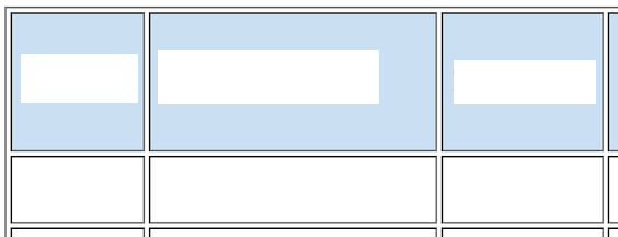
If you look at Chrome, you will see a double line similar to the image.
Here's what you want to do:
- The thickness of the ruled line does not change at any magnification
- I want to make it a simple line instead of a double line
If anyone knows how to solve this problem, please let me know.
Thank you for your cooperation.
1 Answers
As per the reference site, how about setting it to border-spacing:0
<style>
  table { border-collapse:separate; border-spacing:0}
  tr td { border:1px solid black}
  tr td { border-bottom: none }
  tr:last-child td {border-bottom:1px solid gray}
</style>

<table>
  <tr><td>a</td></tr>
  <tr><td>b</td></tr>
</table>
https://codepen.io/yumainaura/pen/eYKXJvP
If you have any answers or tips
© 2024 OneMinuteCode. All rights reserved.