How to insert elements into a responsive screen
Asked 2 years ago, Updated 2 years ago, 398 views
1 Answers
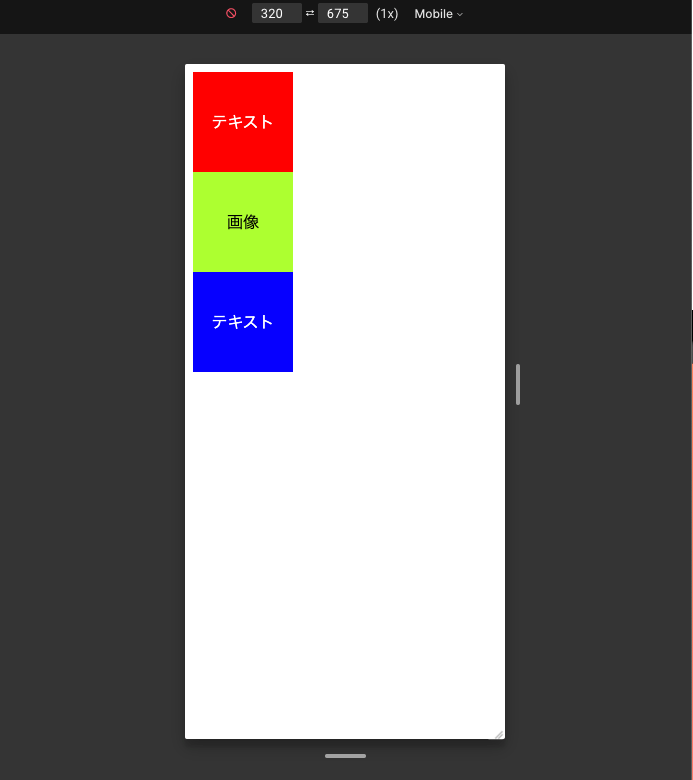
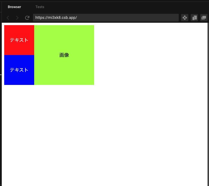
Share the method using Grid.(Mobile First)
...
<div class="container">
  <div class="text-container red">text</div>
  <div class="image-container green">Image</div>
  <div class="text-container blue">text</div>
</div>
...
.container{
  display:grid;
  grid-template-columns —100px;
  grid-template-rows:repeat(3,100px);
}
/* Center text*/
.text-container,
.image-container{
  display:grid;
  place-items:center;
}
.text-container {
  color:white;
}
.red{
  background-color:red;
}
.green{
  background-color:greenyellow;
}
.blue{
  background-color:blue;
}

@media screen and (min-width:450px) {
  US>.container{
    grid-template-columns:repeat(3,100px);
    grid-template-rows:repeat(2,100px);
    grid-template-areas:
      "text-one image image"
      "text-two image";
  }
  .text-container.red{
    grid-area:text-one;
  }
  .image-container{
    grid-area:image;
  }
  .text-container.blue{
    grid-area:text-two;
  }
}
Demo codesandbox
https://codesandbox.io/s/stakoverflow-jp-resposible-mi3xk8?file=/style.css:0-736
mobile
Desktop
2022-09-30 22:05
If you have any answers or tips
Popular Tags
python x 4647
android x 1593
java x 1494
javascript x 1427
c x 927
c++ x 878
ruby-on-rails x 696
php x 692
python3 x 685
html x 656
© 2024 OneMinuteCode. All rights reserved.