I want to place 5 images up and down in the CSS.
Asked 2 years ago, Updated 2 years ago, 361 viewsI'm designing a page with HTML, CSS, and Bootstrap.
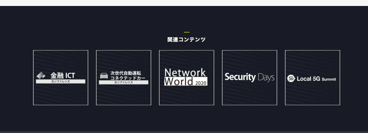
I would like to make the following design on https://www.f2ff.jp/event/iotc-2020-02.
There is no movement, only the arrangement is necessary.
I'd like to arrange this in 5 boxes in 2 rows.
What should I do?I'm trying a lot of things right now, but it's full, so I'd appreciate your advice.
The current situation is as follows:
I'm studying the arrangement of 5 rows and flex using Bootstrap, but it's hard to get my way.
I would appreciate your support.
▼html
<section class="testimonials carousel-single section-padding bg-img bg-fixed" data-overlay-dark="7" data-background="img/bg4.jpg">
            <div class="container">
                <div class="row">
                    <img class="testimonials-img" src="img/blog/1.jpg" alt="">
                    <img class="testimonials-img" src="img/blog/1.jpg" alt="">
                    <img class="testimonials-img" src="img/blog/1.jpg" alt="">
                    <img class="testimonials-img" src="img/blog/1.jpg" alt="">
                    <img class="testimonials-img" src="img/blog/1.jpg" alt="">
                </div>


            </div>
        </section>
▼ CSS
*{
  margin:0;
  padding:0;
  - webkit-box-sizing: border-box;
          box-sizing: border-box;
  outline: none;
  list-style: none;
  word-wrap:break-word;
}

body{
  color:#000;
  line-height: 1.3;
  font-weight:400;
  font-size: 14px;
  font-family: 'Rubik', sans-serif;
  overflow-x —hidden!important;
}

p{
  font-size: 15px;
  font-weight: 300;
  color:#7f7f7f;
  line-height: 1.6;
  margin:0;
}

img{
  width: 100%;
  height —auto;
}

span, a, a —hover{
  display:inline-block;
  text-decoration: none;
  color:inherit;
}

.section-padding {
  padding: 120px0;
}

.section-head {
  margin-bottom —80px;
}
.section-head h6 {
  color:#333;
  font-size: 11px;
  font-weight —500;
  text-transform:uppercase;
  letter-spacing —2px;
  display:inline-block;
  padding:015px;
  position:relative;
}
.section-head h6:before, .section-head h6:after {
  content:';
  width —40px;
  height —1px;
  background-color:#2AAFC0;
  position:absolute;
  bottom : 3px;
}
.section-head h6:before {
  left: -40px;
}
.section-head h6:after {
  right: -40px;
}
.section-head h4 {
  font-size: 30px;
  font-weight:600;
  margin-bottom —15px;
}

.bg-gray{
  background: #f7f7f7;
}

.o-hidden {
  overflow — hidden;
}

.position-re{
  position:relative;
}

.full-width{
  width —100%!important;
}

.lg-line-height{
  line-height: 1.5;
}

.bg-img{
  background-size:cover;
  background-repeat —No-repeat;
}

.bg-fixed {
  background-attachment:fixed;
}

.value{
  display:-webkit-box;
  display:-ms-flexbox;
  display:flex;
  - webkit-box-align:center;
  -ms-flex-align:center;
  align-items:center;
}

.v-middle {
  position:absolute;
  width: 100%;
  top: 50%;
  left:0;
  -webkit-transform:translate (0%, -50%);
  transform —translate (0%, -50%);
}

.owl-theme.owl-nav.disabled+.owl-dots{
  margin-top —15px;
  line-height:.7;
}

.owl-theme.owl-dots.owl-dotspan{
  width —8px;
  height —8px;
  margin —07px;
  border-radius: 50%;
  background: #ddd;
}

.owl-theme.owl-dots.owl-dot.active span,
.owl-theme.owl-dots.owl-dot:hoverspan{
  background: #2AAFC0;
}


.testimonials.row {
  display:flex;
  margin-left: -20px;
}

.testimonials.testimonials-img{
  margin —10px auto;
  width: 100%;
  margin-left —20px;
  height —60px;
}
[Additional note]
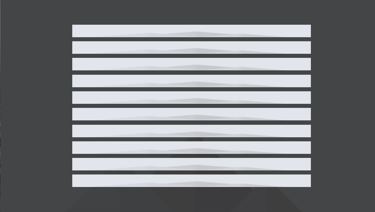
Currently, we are able to do the following.
However, it is not arranged evenly.
We are also looking for a way to make it into two rows.
I also tried justify-content:space-around, but it didn't work.
I would appreciate it if you could give me some advice.
▼ HTML
<div class="flex-container">
                <div class="flex-item">
                    <img class="testimonials-img" src="img/blog/1.jpg" alt="">
                </div>
                <div class="flex-item">
                    <img class="testimonials-img" src="img/blog/1.jpg" alt="">
                </div>
                <div class="flex-item">
                    <img class="testimonials-img" src="img/blog/1.jpg" alt="">
                </div>
             <div class="flex-item">
                    <img class="testimonials-img" src="img/blog/1.jpg" alt="">
                </div>
                <div class="flex-item">
                    <img class="testimonials-img" src="img/blog/1.jpg" alt="">
                </div>
            </div>
▼ CSS
/* Parent element (container)*/
.flex-container{
    background-color:#dfdfdf;
    display:flex;
}
/* Child Elements (item)
.flex-item{
    margin —10px auto;
    padding —5px10px;
    box-sizing: border-box;
    background-color:#343434;
    color:#fff;
}
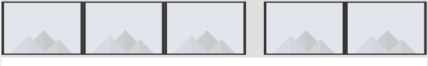
1 Answers
It was done with the following code.
▼ HTML
<div class="flex-container">
                <ul>
                    <li><img class="testimonials-img" src="img/blog/1.jpg" alt=">/li>;
                    <li><img class="testimonials-img" src="img/blog/1.jpg" alt=">/li>;
                    <li><img class="testimonials-img" src="img/blog/1.jpg" alt=">/li>;
                    <li><img class="testimonials-img" src="img/blog/1.jpg" alt=">/li>;
                    <li><img class="testimonials-img" src="img/blog/1.jpg" alt=">/li>;
                </ul>

            </div>
▼ CSS
ul{
  display:flex;
  justify-content:space-evenly;
}

li{
  margin —10px;
  position:relative;
  width: 20%;
}
If you have any answers or tips
© 2024 OneMinuteCode. All rights reserved.