How many pixels can I print on A4 paper?
Asked 2 years ago, Updated 2 years ago, 192 viewsWhen printing html pages with browser-standard printing capabilities, how many pixels wide can a vertical A4 paper fit?
css
*{
  box-sizing: border-box;
}
.test1{
  width —1366px;
  border —10px solid red;
}
.test2{
  width —1280px;
  border —10px solid green;
}
.test3{
  width —1024px;
  border —10px solid blue;
}
html
<body>
  <div class="test1">test111366px</div>
  <div class="test2">test2 1280px</div>
  <div class="test3">test3 1024px</div>
</body>
When I tried previewing on a page like the one above, Chrome and IE11 and Edge
1366px → Overhanging Paper
1280px→ Overflowing from paper
1024px→Fits in paper
It turned out that
Only FireFox can fit all sizes on paper.
If I create a page with a width of about 1024px, can I think that the standard printing function of all browsers fits the A4 vertical width?
Or do these sizes depend on the terminal environment (such as a display)?
Please let me know if there is a way to calculate the corresponding number of pixels on A4 paper.
3 Answers
px is determined based on the viewing angle, but for printers, the standard 1px=1/96th of 1in applies (W3CCSS3.A4 has a width of 8.27 inches, so 8.27 x 96 = 794px.
Then, if you create a page with a width of about 1024px, the browser's printing function will fit the A4 vertical width because FireFox, IE11 and Edge have the default of "shrink and print the whole" and Chrome doesn't have the setting of "shrink and print the whole" automatically.In addition, the Linux version of Chrome does not have the ability to "reduce and print the whole thing" without permission, and it will stick out at a width of 1024px.
"Also, even if IE11 and Edge are ""reduced and printed out,"" 1280px will stick out of the paper, not related to standards, but rather IE11 and Edge specifications."
The unit px has been modified in CSS 2.1.
Until CSS 2.0, relative length units
Relative units are:
- px:pixels, relative to the viewing device
From CSS 2.1, absolute length units
The absolute units consult of the physical units (in, cm, mm, pt, pc) and the px unit:
- px:pixel units—1px is equal to 0.75pt.
However, even after CSS 2.1
The reference pixel is the visual angle of one pixel on a device with a pixel density of 96 dpi and a distance from the reader of an arm's length.
and px are defined as being based on the viewing angle rather than the physical length.In other words, the length varies depending on the distance from the eye.Also, I think that each browser is not according to the specifications due to its historical background.Therefore, CSS 2.1 is also
For power-resolution devices, and devices with unusual viewing distances, it is recommended installed that the anchor unit be the pixel unit. For such devices it is recommended that the pixel unit refer to the whole number of device pixels that the best approaches the reference.
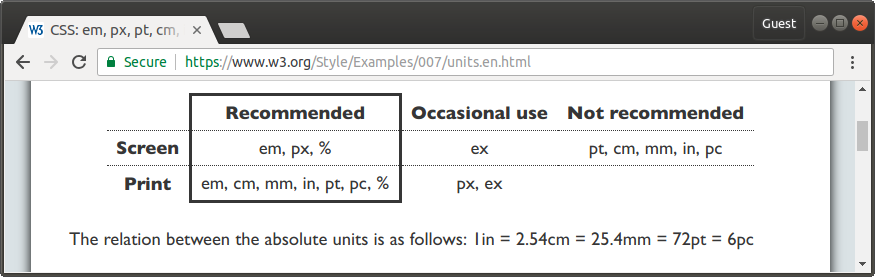
We recommend using px for low-resolution devices such as and monitors, and other absolute length units for high-resolution devices such as printers.
Therefore, if printing is considered, use units such as in, cm, mm, pt, and pc, instead of px.In the CSS, you can specify media type separated by screen and print.
If I create a page with a width of about 1024px, can I think that the standard printing function of all browsers fits the A4 vertical width?
Or do these sizes depend on your device's environment (such as a display)?
There is also printable space on the printer, and the browser's scaling specifications may have an impact.
If you are familiar with the specifications of each manufacturer's printer driver and browser, you may understand, but I am not sure about this.
As a reality, I have seen a business form design with 970px width.
Please let me know if there is a way to calculate the corresponding number of pixels on A4 paper.
A4 width 210mm on the CSS maps to 794px.
https://codepen.io/DriftwoodJP/pen/pZvJOv
*{
  box-sizing: border-box;
}

// .test1{
//   width —1366px;
//   border —10px solid red;
// }
// .test2{
//   width —1280px;
//   border —10px solid green;
// }
// .test3{
//   width —1024px;
//   border —10px solid blue;
// }
@page{
  size:A4;
  margin:0;
}

@media print {
  html,
  body{
    width: 210mm;
    height: 297mm;
  }
}

.mm{
  width: 210mm;
  border —10px solid gray;
}

.pixel{
  width —794px;
  border —10px solid gray;
}
<div class='test1'>
test11366px
</div>
<div class='test2'>
test2 1280px
</div>
<div class='test3'>
test3 1024px
</div>
<div class='mm'>
mm 210 mm
</div>
<div class='pixel'>
Pixel 794px
</div>To learn how physical lengths are translated into pixels, the following is helpful:
Also, we refer to the following site for paper size (96PPI).
A4 (794px*1123px) is easy to lay out.
I've only dealt with variable width sentences and tables myself, so I'm looking forward to enhancing this topic.
If you have any answers or tips
© 2024 OneMinuteCode. All rights reserved.