I want Twitter Bootstrap to align the height of the columns side by side in a "responsive" manner.
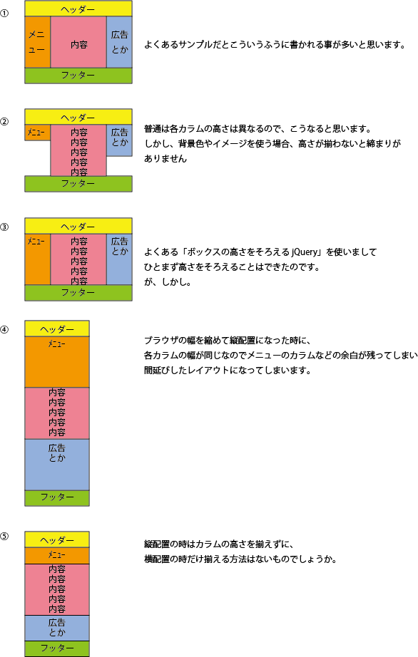
Asked 2 years ago, Updated 2 years ago, 116 viewsFor common samples such as the following, I think that each column is written in the same height as attached image 1.
<div class="row">
    <div class="col-md-12">Header</div>
</div>
<div class="row">
    <div class="col-md-2">Menu</div>
    <div class="col-md-8">Contents</div>
    <div class="col-md-2">Advertising </div>
</div>
<div class="row">
    <div class="col-md-12"> footer</div>
</div>
If you actually make a page, the height of each column is usually different, so I think each column will be different as shown in image 2.
However, when using background colors and images, if the height is not aligned, there will be no tightness.
I was able to adjust the height like 3 by using the common "jQuery to adjust the height of the box."
However.
When you reduce the browser width and place it vertically, each column has the same width, so it's a disappointing layout because there's a margin left, such as a column on the menu as shown in 4.
For vertical placement, use
to match the contents of the column as shown in 5.
Is there a way to align it like 3 only for horizontal placement?
1 Answers
There seems to be a plug-in that has the ability to align height only when the window width is more than a certain amount.
"jquery.heightLine.js" with responsive web design-to-R
By the way, if you align the height with display:table-cell and switch to MediaQuery, you can do it with CSS alone (although the Bootstrap column uses float, the method will change a lot).
If you have any answers or tips
© 2024 OneMinuteCode. All rights reserved.