I want to change the position of the button depending on the display size of the terminal (Swift)
Asked 2 years ago, Updated 2 years ago, 45 viewsPosition the button on the StoryBoard. I would like to change it according to the display size of the application execution terminal.
To change the position
button_Save.frame.origin.y+=100
I thought it would be good to set it up like this, but it didn't change.
How do I set it up?
This button is connected to an outlet and has no specific restrictions.
override func viewDidLoad(){
    super.viewDidLoad()

    displaySize=self.view.frame.size
    if displaySize.height==480 {//4/4S
         print ("this is iPhone 4/4s")
         // Do Nothing. This is base size
    }
    else if displaySize.height==568 {//5/5S
        // Move the save button down
        print ("this is iPhone 5/5s")
        button_Save.frame.origin.y+=100
    }
(abbreviated below)
}
4 Answers
I would like to change it according to the display size of the application execution terminal.
You want to change it according to the display size, but iOS 8 or later size class was introduced.You can also easily create an interface that fits your screen size using auto-layout.
For example, change the placement of buttons (UIButton) depending on the screen size:
Drag and drop buttons from the Object Library to place them.
Figure 1
Set constraints on the buttons you just placed.
Figure 2
Change the size class to Any width and Compact height.
Figure 3
In this size class, move and relocate the buttons to where you want them to be placed.
Figure 4
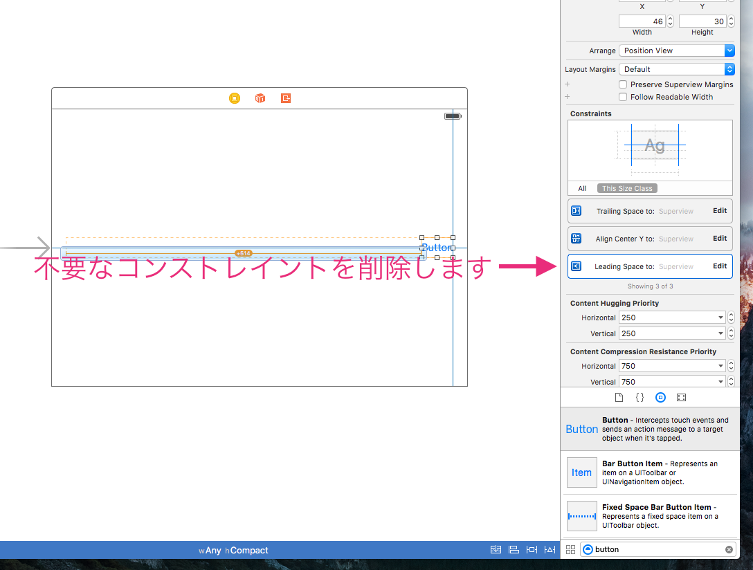
Reconfigure button constraints.First, hold the mouse cursor over the button, and then press and hold the control key and drag to draw a blue line.Drag this blue line to make the associated target view and release the mouse.
Figure 5
The menu appears, so select the constraint of the training space.
Figure 6
Then remove the constraint that causes the conflict.Select the constraint of the leading space indicated in Figure 7 and press the delete key to delete it.
Figure 7
So far, I have finished setting the button position to change depending on the screen size.
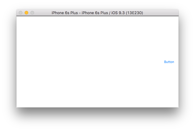
Let's run it and see if the position of the button changes.R Run on R.
Portraits have buttons on the left-center edge.
Figure 8
When you switch to the landscape, the button is placed on the far right center.
Figure 9
This size class and auto-layout make it easy to create an interface that fits your screen size.
In this example, you can also change the following points for each size class and change the interface to suit each screen size, as you did with constraints added and removed in a size class.
* Change View Size and Location
* Add/Remove Views
* Modifying, Adding, and Removing Constraints
* Changing Labels, Text Fields, Text Views, and Buttons
It is explained in detail in the following literature, so please refer to it.
Adaptive User Interfaces
Building Adaptive Apps with UIKit-WWDC 2014
Size Classes Design Help
I might have solved it myself.
I have been trying to do this with override func viewDidLoad(), but when I created override func viewDidLayoutSubviews(), I was able to change the position of the button.
You can change the displayed string in viewDidLoad(), but the layout is
It seems that it cannot be changed without viewDidLayoutSubviews().
override func viewDidLayoutSubviews(){
    super.viewDidLayoutSubviews()

    displaySize=self.view.frame.size
    if displaySize.height==480 {//4/4S
         print ("this is iPhone 4/4s")
         // Do Nothing. This is base size
    }
    else if displaySize.height==568 {//5/5S
        // Move the save button down
        print ("this is iPhone 5/5s")
        button_Save.frame.origin.y+=100
    }
(abbreviated below)
}
Yuu Q, thank you for your very polite reply.
I understand that constraints can be set according to the size class.
However, I feel once again that it is necessary to use various constraints for each device in the same size class, and I need to give a lot of tips. (*The reason will be explained later.)
Once I have organized the current situation, it will be as follows.
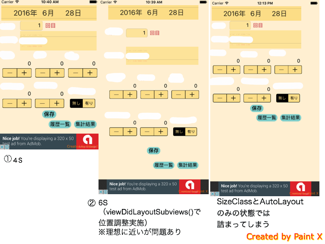
This time, I am trying to create a vertical app for iPhone 4/4S/5S/6/6S/6Plus.W:C, H:R in the size class.
By arranging the layout with the coding in viewDidLayoutSubviews(), which I want to arrange the display for each terminal in this size class, I'm getting closer to the ideal for the first time in terms of appearance.(Image 。. The state of the rightmost image before coding.)
However, there are also some problems.
1—Code becomes redundant
2: With UISegmentedControl, when I tap, the controller moves from the image position of の to the rightmost image position, so I need to deal with it
Therefore, I am thinking that it is possible to set it from StoryBoard as much as possible.
I looked it up and found out that
·Specify the ratio according to the screen size by placing multiple UI Views (reference link 1)
·Add an outlet for space constraints and specify the ratio of each terminal as constraints (reference link 2)
·Insert a dummy UIView between the controllers and specify the ratio of gaps for each terminal as restrictions
I learned how to do this.
(*I feel that everyone is struggling.This is where I felt like I needed some tips.)
In conclusion
·For each size class, constraints can be specified relatively easily from the StoryBoard
"·For the same size class, ""I will do my best using constraints"" to get closer to my ideal."
I have come to the idea that
I'm not familiar with size classes, auto-layouts, and constraints yet, so if
Please let me know if there is a way to adjust the same size class more easily.
/// Below, reference links and images ///
アクセス For access, add h to the head
Link 1: How to Specify View Size and UI Layout Percentage in AutoLayout
ttp://qiita.com/emadurandal/items/04c11db5eb1117eabe1e
[Link 2: [Swift] How to change restrictions only for specific device screen sizes in Auto Layout]
ttp://egg-is-world.com/2014/12/25/auto-layout-device/
About AutoLayoutIf you haven't seen here, please read it.
For my part, I would recommend using grouping and stack views.
(1) Grouping a group of UI parts next to each other
If you select Editor > Embedded In > View from the Xcode menu with all elements selected for the group, a new UIView containing all selected elements is added to the View hierarchy.As for the screen shown in your answer, would it be appropriate to organize it into 5-6 groups?
(2) Enclose the above group with a stack view
Select all the UIViews that represent the 5-6 groups you created in (1) above and create a UISTackView with those groups as child elements in Editor > Embedded In > Stack View.
(3) Setting the Stack View Attributes
Set Axis to Vertical and Distribution to Equal Spacing after fine tuning.This will lay out the gaps in each group to be the same width.
(4) Set appropriate constraints within the group
It's pretty tough to put a lot of restrictions on the entire screen, but it should be relatively easy to set if it's within a group that's narrowed down to a certain extent.
It's a little difficult to understand just by words, but I think it would be easier for you to understand if you could make a simplified sample yourself and read it again while trying it out.
Stack views are iOS 9 and later features and cannot be used if earlier versions need to be supported, but grouping and managing them when there are many UI elements throughout the screen is still a valid way to use stack views.Please give it a try.
If you have any answers or tips
© 2025 OneMinuteCode. All rights reserved.